Reference-free cell type deconvolution
Statistical analysisThe contribution of cellular populations in each spot can be estimated using deconvolution methodes, which generally rely on a scRNA-seq gene expression profiles reference. However, such reference may not exist due to budgetary, technical, or biological limitations. Moreover, both single cell and spatial gene expression have their own bias limitating the extrapolation of dissociated data on spatial data. For these reasons, it may be useful to use a reference-free deconvolution tool, which infers modules of covarying genes and their contribution to each spot.
Module specifications
| Input data | Computationnal environnement | Output data |
|---|---|---|
|
Gene expression raw count matrix, Spatial positions |
Visium_data_analysis R Python Bash |
beta matrix, theta matrix, annotated data matrices |
Code
This code is based on the following documentation :
STDeconvolve R package
Miller BF, Huang F, Atta L, Sahoo A, Fan J. Reference-free cell type deconvolution of multi-cellular pixel-resolution spatially resolved transcriptomics data. Nat Commun. 2022;13(1):2339. Published 2022 Apr 29. doi:10.1038/s41467-022-30033-z
- https://jef.works/STdeconvolve/process_bcl_data.html
- https://github.com/JEFworks-Lab/STdeconvolve/issues/37
- https://jef.works/STdeconvolve/failure_examples.html
- https://github.com/JEFworks-Lab/STdeconvolve?tab=readme-ov-file
- https://github.com/JEFworks-Lab/STdeconvolve/blob/devel/docs/visium_10x.md
This module require to load the following environment of R packages :
source("/home/truchi/Starter_pack.R")
Informations about the demo dataset :
The demo dataset is a collection of 6 10X Genomics Visium slide of bleomycin-treated lungs of young and old mice, collected after 14 or 28 days following treatment.
Notes
When having multiple Visium slides, reference-free cell type deconvolution can be either performed on the aggregated count matrix of all samples, or on each slide individually. There are pros and cons for each approach, as commented here. Roughly, the aggregation of all counts allows topics to be calculated just once, and thus produces a comparable annotation of all slides, with the risk of masking topics specific to a particular slide. The slide-by-slide approach, on the other hand, provides a more precise annotation, but at the risk of a kind of "overfitting" : obtaining a different number of topics between slides, each carried by specific gene modules, making the comparison between slides inextricable. Both approaches should be tried out, as results depend on the homogeneity of the cross-sections and the experimental conditions under which they are obtained.
1. Pre-processing
1.1 Read space ranger outputs
The first step is to read the space ranger outputs using the SpatialExperiment R package. The directories produced for each sample have to be organized as described in the documentation of read10xVisium function (your actual repertory tree may differ according to the used space ranger version).
# Change your working directory to the repertory containing all space ranger outputs
dr <- c("/my/directory/visium_data/")
setwd(dr)
Optionnaly, you can replace "ensembl id" to "gene symbol" in the features table file. Indeed, read10xVisium will take only the first column of the table, which are by default ensembl id, and there is no option to change it. This function replaces "ensembl id" to "gene symbol" in the features table file for each sample directory:
samples_dir <- c("S1B1","S1C1","S1D1","S2A1","S2C1","S2D1")
for (sample in samples_dir) {
  features <- read.table(paste0(dr,sample,"/outs/filtered_feature_bc_matrix/features.tsv.gz"), sep = "\t")
  features$V1 <- make.unique(features$V2)
  write.table(features,file = paste0(dr,sample,"/outs/filtered_feature_bc_matrix/features.tsv"),quote = FALSE, sep = "\t",col.names = FALSE,row.names = FALSE)
}
# Don't forget to gzip the features.tsv file after writing it !
Working with multiple samples requires specific barcode names for each spot, to avoid redundancy. You can for example add a prefix corresponding to the slide name to each barcode.
S1B1 <- SpatialExperiment::read10xVisium("./S1B1", type = "sparse", data = "filtered")
colnames(S1B1) <- rownames(S1B1@int_colData@listData[["spatialCoords"]]) <- S1B1@assays@data@listData[["counts"]]@Dimnames[[2]] <- paste0("S1B1.",colnames(S1B1) )
S1C1 <- SpatialExperiment::read10xVisium("./S1C1", type = "sparse", data = "filtered")
colnames(S1C1) <- rownames(S1C1@int_colData@listData[["spatialCoords"]]) <- S1C1@assays@data@listData[["counts"]]@Dimnames[[2]]<- paste0("S1C1.",colnames(S1C1) )
S1D1 <- SpatialExperiment::read10xVisium("./S1D1", type = "sparse", data = "filtered")
colnames(S1D1) <- rownames(S1D1@int_colData@listData[["spatialCoords"]]) <- S1D1@assays@data@listData[["counts"]]@Dimnames[[2]]<- paste0("S1D1.",colnames(S1D1) )
S2A1 <- SpatialExperiment::read10xVisium("./S2A1", type = "sparse", data = "filtered")
colnames(S2A1) <- rownames(S2A1@int_colData@listData[["spatialCoords"]]) <- S2A1@assays@data@listData[["counts"]]@Dimnames[[2]]<- paste0("S2A1.",colnames(S2A1) )
S2C1 <- SpatialExperiment::read10xVisium("./S2C1", type = "sparse", data = "filtered")
colnames(S2C1) <- rownames(S2C1@int_colData@listData[["spatialCoords"]]) <- S2C1@assays@data@listData[["counts"]]@Dimnames[[2]]<- paste0("S2C1.",colnames(S2C1) )
S2D1 <- SpatialExperiment::read10xVisium("./S2D1", type = "sparse", data = "filtered")
colnames(S2D1) <- rownames(S2D1@int_colData@listData[["spatialCoords"]]) <- S2D1@assays@data@listData[["counts"]]@Dimnames[[2]]<- paste0("S2D1.",colnames(S2D1) )
1.2 Combine informations from all slices
# Concatenate counts and positions for all samples
all_counts <- cbind(as.matrix(counts(S1B1)), as.matrix(counts(S1C1)), as.matrix(counts(S1D1)), as.matrix(counts(S2A1)), as.matrix(counts(S2C1)), as.matrix(counts(S2D1)))

all_pos <- rbind(spatialCoords(S1B1), spatialCoords(S1C1), spatialCoords(S1D1), spatialCoords(S2A1), spatialCoords(S2C1), spatialCoords(S2D1))

# Then, assign slice identifiers
slices <- c("S1B1","S1C1","S1D1","S2A1","S2C1","S2D1")
S1B1_slice <- rep("S1B1", nrow(spatialCoords(S1B1)))
S1C1_slice <- rep("S1C1", nrow(spatialCoords(S1C1)))
S1D1_slice <- rep("S1D1", nrow(spatialCoords(S1D1)))
S2A1_slice <- rep("S2A1", nrow(spatialCoords(S2A1)))
S2C1_slice <- rep("S2C1", nrow(spatialCoords(S2C1)))
S2D1_slice <- rep("S2D1", nrow(spatialCoords(S2D1)))
all_slice <- c(S1B1_slice, S1C1_slice, S1D1_slice,S2A1_slice,S2C1_slice,S2D1_slice)
names(all_slice) <- rownames(all_pos)

# Finally, merge the 6 sections together
all_paths <- list()
all_paths[["S1B1"]] <- as.matrix(t(all_counts[, names(all_slice[all_slice == "S1B1"])]))
all_paths[["S1C1"]] <- as.matrix(t(all_counts[, names(all_slice[all_slice == "S1C1"])]))
all_paths[["S1D1"]] <- as.matrix(t(all_counts[, names(all_slice[all_slice == "S1D1"])]))
all_paths[["S2A1"]] <- as.matrix(t(all_counts[, names(all_slice[all_slice == "S2A1"])]))
all_paths[["S2C1"]] <- as.matrix(t(all_counts[, names(all_slice[all_slice == "S2C1"])]))
all_paths[["S2D1"]] <- as.matrix(t(all_counts[, names(all_slice[all_slice == "S2D1"])]))
1.3 Select overly-dispersed genes
STdeconvolve infers modules of covarying genes, called topics, based on overly-dispersed (OD) genes in the spatial counts data. To be considered for OD selection, a gene must be detected in all slices and optionnally, have to be an "informative" gene, i.e. a gene which will help the annotation of the topic.
In the loaded R environment, you should have a custom fonction called findunwantedgenes.mm (for mouse or .hs for human).
Applied to a vector of gene symbols, this function will find all symbols that can be considered as unwanted genes, such as mitochondrial, ribosomal, pseudo-genes, hemoglobin or genes associated to dissociation-induced stress.
You can choose which category of genes to consider as unwanted directly by commenting a particular line
# Take the intersection of all genes in all slices
all_genes <- lapply(all_paths, function(p){
  print(dim(p))
  genes <- colnames(p)
  print(length(genes))
  genes
})
all_genes <- Reduce(intersect, all_genes)
length(all_genes)

# Keep only informative genes to calculate dispersion
genes.to.remove <- findunwantedgenes.mm(all_genes) %>% unlist()
all_genes <- setdiff(all_genes,genes.to.remove)
OD calculation is performed on each sample, with the preprocess function, which contains many arguments to be adjusted in order to filter out over/under-expressed genes as well as low-content spots. We will run it in 2 steps :
# First, list OD genes in each slice and select the union, without removing spots
all_ODgenes <- lapply(all_paths, function(p) {
  dat <- preprocess(p,
                    extractPos = FALSE,
                    selected.genes = all_genes,
                    nTopGenes = 5,
                    genes.to.remove = NA,
                    removeAbove = 0.95,
                    removeBelow = NA,
                    min.reads = 10,
                    min.lib.size = 1,
                    min.detected = 1,
                    ODgenes = TRUE,
                    od.genes.alpha = 0.05,
                    gam.k = 5,
                    nTopOD = 1000)
  colnames(dat$corpus)
})
unionAllGenes <- Reduce(union, all_ODgenes)
length(unionAllGenes)

# Then, select only spots where OD genes are sufficiently detected
allCorpus <- preprocess(t(as.matrix(all_counts)),
                        extractPos = FALSE,
                        selected.genes = unionAllGenes,
                        min.lib.size = 200,
                        min.detected = 10,
                        ODgenes = FALSE  )
allCorpus$pos <- all_pos[rownames(allCorpus$corpus), ]

# Filter spots in all_slice based on those kept in the corpus
all_slice_filt <- all_slice[match(rownames(allCorpus$pos),names(all_slice))]
length(all_slice_filt)
allCorpus$slice <- all_slice_filt
dim(allCorpus$corpus)
2. Computing topics
Topics identification is based on Latent Dirichlet Allocation (LDA), a generative statistical model. In the context of natural language processing, LDA is used for discovering topics in collections of documents, where each document is a mixture of topics and each topic is a mixture of words. In the context of spatial transcriptomics, a topic is a spatial gene expression pattern. Each spatial location is considered a mixture of these topics, and each topic is a mixture of gene expression.
2.1 Fit LDA models to the data
Even with parallelization, this step can take several hours to run depending on the dataset size and on the number of K parameters, which correspond to the expected number of celltypes to fit models with.
# Here, we choose to fit the model with 5 to 20 celltypes
# Doing a KNN clustering on all spots should indicate the rough number of communities to expect
ldas <- fitLDA(allCorpus$corpus, Ks = seq(5, 20, by = 1),
               perc.rare.thresh = 0.05,
               ncores=20,
               plot=TRUE,
               verbose=TRUE)
To help you choosing the "optimal" K number of topics, look at the output plot.
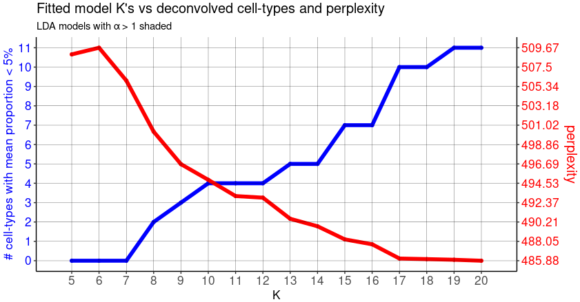
- The red line shows the trend between choice of K and the respective model perplexity. The lower the perplexity, the better the model represents the real dataset.
- The blue line shows the trend between choice of K and the number of deconvolved cell-types with mean pixel proportions < 5%, corresponding to "rare" celltypes.
We note that as K is increased for fitted LDA models,the perplexity is decreasing while the number of "rare" cell-types generally increases. It means that increasing complexity in terms of celltypes heterogeneity is more realistic, but at the risk of adding non-relevant or redondant topics.
To find a good compromise, the authors recommand to select a K with the lowest perplexity while minimizing the number of "rare" deconvolved cell-types.
Here we chose a arbitrary K=14
optLDAS <- optimalModel(models = ldas, opt = 14)
results <- getBetaTheta(optLDAS, perc.filt = 0.05, betaScale = 1000)
# Save the results variable in a .rds object to load it when you want
# saveRDS(results,"deconv_results.rds")
The results variable contains the two main results of the deconvolution :
- The Beta matrix. It's the topics x genes matrix, indicating for each topic the expression of each OD genes.
- The Theta matrix. It's the spots barcodes x topics proportion matrix, indicating for each spot the representation of each topic.
3. Investigating the deconvolution results
The beta and theta matrix, combined with spots positions, are used to describe and annotate the topics, compare the proportions of deconvolved cell types across the spots of each slice, as well as representing the spatial gene expression pattern.
3.1 Describe and annotate each topic
A first informative representation is a correlation matrix between topics signatures from the beta matrix. It can be usefull to identify redondant topics requiring an ajustment of K, and also to group the topics according to their similarities.
# Remove genes which are not significantly contributing to any topics
beta <- as.data.frame(results$beta) %>% t()
max <- data.frame(genes=rownames(beta),max=rowMaxs(beta))
max <- max %>% filter(max>1) %>% pull(genes)
beta <- as.matrix(results$beta)
beta <- beta[,match(max,colnames(beta))]

# Use the STdeconvolve function to compute the correlation
corMtx <- STdeconvolve::getCorrMtx(m1 = beta,m2 = beta,type = "b")

# Print the correlation matrix as a heatmap
corMtx <- round(corMtx,digits = 3)
corMtx[corMtx<0] <- 0
annotation <- data.frame(row.names = rownames(corMtx),topics=paste0("X",rownames(corMtx)))
pheatmap(as.data.frame(corMtx),annotation_col  = annotation,annotation_row  = annotation,show_colnames = T,show_rownames = T,cluster_cols = T,cluster_rows = T,treeheight_row = 0,legend = F,fontsize_col = 10,fontsize_row = 10,
         color = colorRampPalette(brewer.pal(n = 9, name = "Reds"))(100),annotation_legend = F,angle_col = 0,display_numbers=1,number_color="white")
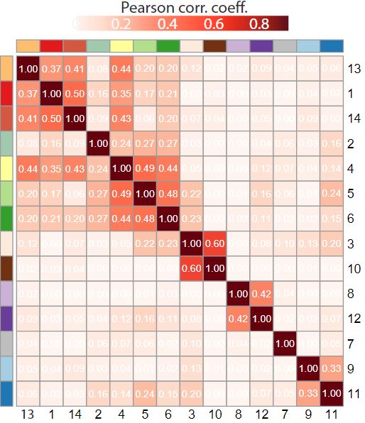
Based on the clustering on the correlation matrix between topics, we can define the order and the color vector of topics. The idea is to represent similar topics with similar colors, as we can imagine that similar topics will have an equivalent spatial representation
colors <- c("X1"="#E31A1C","X2"="#a1c9ae",  "X3"="#fceadc",  "X4"="#FFFF99",  "X5"="#B2DF8A",  "X6"="#33A02C",  "X7"="grey",  "X8"="#CAB2D6",  "X9"="#A6CEE3",  "X10"="#703210", "X11"="#1F78B4", "X12"="#6A3D9A","X13"="#FDBF6F", "X14"= "#d4583f")
topic.order <- c("X1","X14","X13","X4","X5","X6","X2","X3","X10","X9","X11","X7","X12","X8")
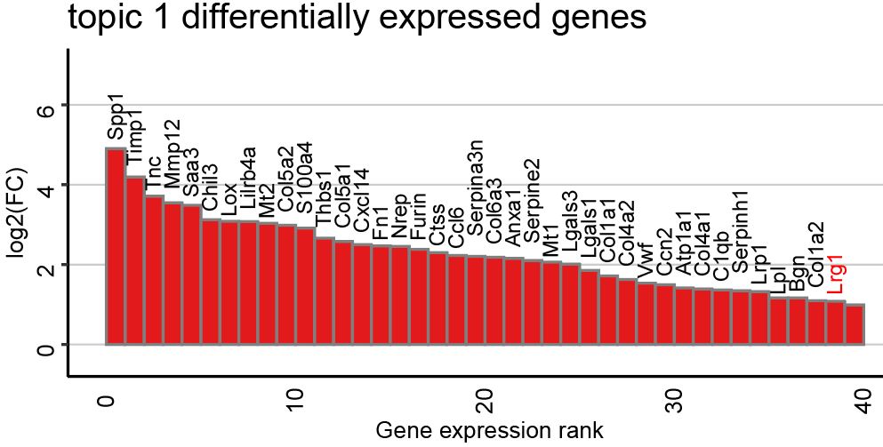
To identify the genes contributing to each topic signature, we can calculate the log2FC between gene expression in a particular topic and the mean expression in the other topics. The following function will plot the top 40 differentially expressed genes ranked by log2FC for each topic.
ps <- lapply(colnames(deconProp), function(celltype) {
  celltype <- as.numeric(celltype)
  # Keep only the most expressed genes in cell-type of interest
  highgexp <- names(which(deconGexp[celltype,] > 1))
  # high log2(fold-change) compared to other deconvolved cell-types
  log2fc <- sort(log2(deconGexp[celltype,highgexp]/colMeans(deconGexp[-celltype,highgexp])), decreasing=TRUE)

  # visualize the transcriptional profile
  dat <- data.frame(values = as.vector(log2fc), genes = names(log2fc), order = seq(length(log2fc)))
  # Hide all of the text labels.
  dat$selectedLabels <- ifelse(abs(dat$values)>1 | dat$genes=="Lrg1",dat$genes,"")
  dat$values <- ifelse(dat$values>5 ,5,dat$values)
  dat$text_col <- ifelse(dat$genes=="Lrg1","highlighted","normal")
  dat$hjust <- ifelse(dat$values>0,-0.25,0.8)
  dat$vjust <- ifelse(dat$values>0,-0.8,-0.6)
  dat <- dat %>% filter(values>0 & order<41)

  color <- colors[paste0("X",celltype)] %>% as.character()
  plt <- ggplot2::ggplot(data = dat) +
    ggplot2::geom_col(ggplot2::aes(x = order, y = values,
                                   fill = factor(selectedLabels == ""),
                                   color = factor(selectedLabels == "")), width = 1) +
    ggplot2::scale_fill_manual(values = c(color,color)) +
    ggplot2::scale_color_manual(values = c(color,color)) +
    ggplot2::scale_y_continuous(expand = c(0, 0), limits = c(-0.8, max(dat$values) + 2.5)) +
    ggplot2::labs(title = paste0("X", celltype),
                  x = "Gene expression rank",
                  y = "log2(FC)") +
    # Write gene symbol labels of top genes
    ggplot2::geom_text(ggplot2::aes(x = order+1, y = values-0.1, label = selectedLabels,color=text_col,vjust = vjust,hjust=hjust), size = 3 ,angle=90) +
    scale_color_manual(values = c("highlighted"="red", "normal"="black"))+
    ggplot2::theme_classic() +
    ggplot2::theme(axis.text.x = ggplot2::element_text(size=10, color = "black",angle = 90),
                   axis.text.y = ggplot2::element_text(size=10, color = "black",angle = 90),
                   axis.title.y = ggplot2::element_text(size=10, color = "black"),
                   axis.title.x = ggplot2::element_text(size=10, color = "black",angle = 180),
                   axis.ticks.x = ggplot2::element_blank(),
                   plot.title = ggplot2::element_text(size=15),
                   panel.background = ggplot2::element_blank(),
                   plot.background = ggplot2::element_blank(),
                   panel.grid.major.y = ggplot2::element_line(size = 0.3, colour = "gray80"),
                   axis.line = ggplot2::element_line(size = 0.5, colour = "black"),
                   legend.position="none")
  plt
})
You can also save those signatures in an excel files, and use it for pathways enrichment analysis.
ps <- lapply(colnames(deconProp), function(celltype) {
  celltype <- as.numeric(celltype)
  highgexp <- names(which(deconGexp[celltype,] > 1))
  log2fc <- sort(log2(deconGexp[celltype,highgexp]/colMeans(deconGexp[-celltype,highgexp])), decreasing=TRUE)
  log2fc <- enframe(log2fc,name = "gene",value = "log2FC")
  log2fc
})
names(ps) <- paste0("topic.",c(1:14))
write.xlsx(ps,file = "VISIUM_topics.xlsx")
3.2 Compare proportions of deconvolved cell types
This function plot the topics representation as a scatter pie for each spot, in each slice.
slices <- c("S1B1","S1C1","S1D1","S2A1","S2C1","S2D1")
viz_topics <- lapply(slices, function(slice) {
  theta1 <- results$theta[rownames(allCorpus$pos)[allCorpus$slice == slice],]
  pos_int1 <- allCorpus$pos[rownames(allCorpus$pos)[allCorpus$slice == slice],] %>% as.data.frame()
  colnames(pos_int1) <- c("y", "x")
  topicCols <- colors[ paste0("X",which(colSums(theta1)>0))]

  plot <- vizAllTopics(theta = theta1,
                       pos = pos_int1,
                       r = 12,
                       lwd = 0.01,
                       topicCols =topicCols,
                       showLegend = TRUE,
                       plotTitle = NA) +
    ggplot2::guides(fill = ggplot2::guide_legend(ncol = 1)) +
    ggplot2::geom_rect(data = data.frame(pos_int1),
                       ggplot2::aes(xmin = min(x) - 90, xmax = max(x) + 90,
                                    ymin = min(y) - 90, ymax = max(y) + 90),
                       fill = NA, color = "black", linetype = "solid", size = 0.5) +
    ggplot2::theme(
      plot.background = ggplot2::element_blank()
    ) +
    ggplot2::guides(colour = "none")
  plot
})
names(viz_topics) <- slices
viz_topics[["S2C1"]]
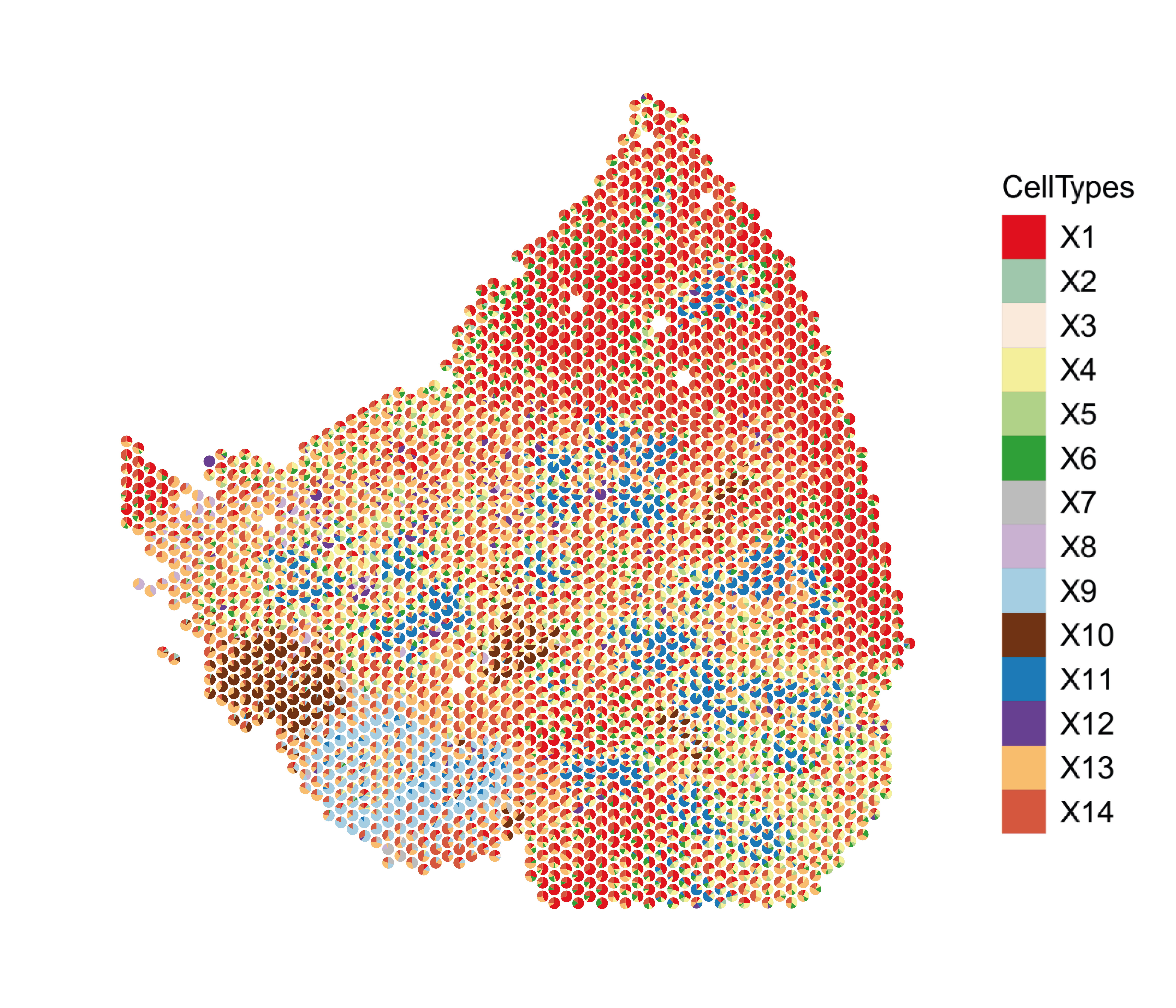
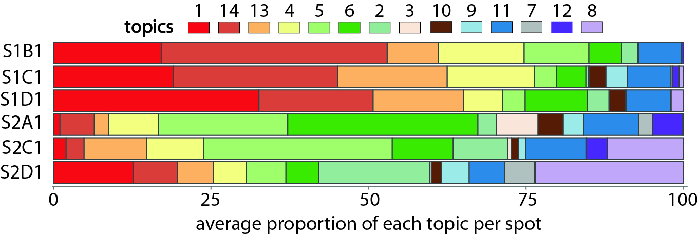
For a better overview, we can calculate the mean proportion of each topic in each slice, and display those proportions in a filled barplot.
metadata <- data.frame()
for (slice in slices) {
  theta1 <- results$theta[rownames(allCorpus$pos)[allCorpus$slice == slice],] %>% as.data.frame()
  theta1 <- colMeans(theta1) %>% as.data.frame()
  theta1 <- data.frame(slice=slice,topic=paste0("X",rownames(theta1)),percent=theta1$.)
  metadata <- rbind( metadata,theta1)
}
metadata$slice <- factor(metadata$slice,levels = rev(slices))
metadata$topic <- factor(metadata$topic,levels = rev(topic.order))

ggplot(metadata, aes(x =percent , y = slice, fill = topic)) +
  geom_bar(stat = 'identity', color = "grey30") +
  scale_fill_manual(values = colors) +
  theme_classic() +
  theme(axis.text.x = element_text(size = 10, angle = 270),
        axis.title.y = element_blank(),axis.title.x = element_blank(),
        axis.text.y = element_blank(),
        axis.line = element_line(colour = "grey50"),
        axis.ticks = element_line(colour = "grey50"),
        legend.text = element_text(size = 12),
        legend.title = element_text(size = 14)) +NoLegend()
